Contrary to popular belief, understanding abstract art isn’t about decoding a secret language of symbols; it’s about tuning into your own body’s response.
- Artists use color, texture, and scale as physical tools to create a direct psychological and even physiological reaction in you, the viewer.
- The artwork is an ’emotional catalyst’—its meaning is co-created in the room through a shared experience, not just observed on a wall.
Recommendation: The first step is to stop *looking for* a hidden meaning and start paying attention to what the artwork *does to you*.
Have you ever stood before a canvas filled with splashes and shapes of color and felt… something? A jolt of energy, a pang of sadness, a sense of calm? Yet, when you try to articulate why, the words fall short. You’re not alone. Many people are taught to look for recognizable objects in art, so when faced with abstraction, they feel lost, as if they’re missing the point. The common advice is to learn color theory—red is passion, blue is calm—or to “just feel it,” which is frustratingly vague.
But what if the key isn’t about decoding a secret message? What if abstract art is less of a language to be read and more of a physical event to be experienced? As an art therapist and painter, I see this all the time. The power of a great abstract work lies not in what it depicts, but in what it *triggers* within your own nervous system. The artist isn’t just painting a picture *of* an emotion; they are creating a catalyst for an emotion to arise *in you*. It’s a form of non-verbal communication that bypasses the logical brain and speaks directly to our sensory, somatic selves.
This guide is designed to give you a new framework for this experience. We will explore how artists use tangible elements like color temperature, physical texture, and immense scale not as symbols, but as tools to manipulate the perceptual environment. You will learn to see the artist’s psychological imprint in their marks and, most importantly, to trust the somatic resonance—the physical feelings—that arise in your own body as the truest interpretation.
To help you navigate this rich, emotional world, this article breaks down the essential components of the abstract experience. From the physics of color to the psychology of the gallery space, you’ll gain the tools to engage with non-objective art on a deeper, more personal level.
Summary: Decoding the Sensory Experience of Abstract Art
- Warm vs Cool: How Color Temperature Changes the Perceived Depth of a Canvas?
- Rothko’s Rule: Why Abstract Art Must Be Seen in Person, Not on Instagram?
- My Kid Could Do That: What Separates a Masterpiece From a Mess?
- Framing Abstraction: To Float or Not to Float Your Canvas?
- Impasto Techniques: How Thick Paint Creates Shadow and Physicality?
- Seeing in Grey: How to Train Your Eye to Ignore Color Distractions?
- Too Much Stimulus: When Does Immersion Become Nausea or Anxiety?
- How to Access Pure Expressionism to Overcome Creative Block?
Warm vs Cool: How Color Temperature Changes the Perceived Depth of a Canvas?
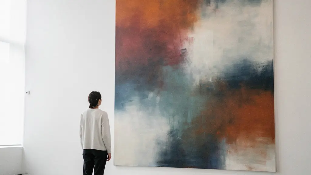
The first and most immediate tool an abstract artist uses to communicate is color, but not in the simplistic way we’re often taught. The true power lies in color temperature. Our brains are hardwired to interpret warm colors (reds, oranges, yellows) as advancing, moving toward us, while cool colors (blues, greens, violets) appear to recede. This isn’t just a stylistic choice; it’s a perceptual hack. An artist can create a sense of deep, vibrating space on a flat surface simply by placing a cool blue next to a warm red. The boundary between them becomes an active, energetic zone.
Think of it as a form of visual vibration. A field of warm yellow doesn’t just “represent” happiness; it physically seems to expand and radiate, creating a somatic resonance of openness in the viewer. A deep indigo, by contrast, can feel like it’s pulling you inward, creating a more introspective or melancholic state. Master abstract painters are experts in this, understanding that even within a single color family, there are warm and cool variations. A French Ultramarine, for instance, is a “warm” blue because of its slight purple bias, and it will behave differently next to a “cool” Cerulean blue.
This manipulation of the perceptual environment is so precise that even the lighting in a gallery can alter the work’s emotional impact. This sensitivity is why research on museum lighting preferences shows that a balanced temperature of around 3600K is often preferred for viewing artwork, preventing the color relationships from being distorted by light that is too warm or too cold. The artist’s use of color temperature is an invitation for your eyes to physically move into, out of, and around the canvas, creating depth where there is none.
Rothko’s Rule: Why Abstract Art Must Be Seen in Person, Not on Instagram?
Viewing an abstract painting on a phone screen is like listening to a symphony through a laptop speaker—you get the notes, but you miss the feeling. This is because a great abstract work is not an image; it is an environment. No one understood this better than Mark Rothko. He famously believed that his large-scale color field paintings had to be seen from a specific, close distance (around 18 inches) in a dimly lit room. He wasn’t being precious; he was dictating the terms of an emotional event. At that proximity, the canvas fills your entire field of vision, and the colors cease to be something you *look at* and become something you are *in*. The visual vibration becomes a full-body experience.
This idea is perfectly captured in his simple but profound statement, highlighted during a Museum of Fine Arts, Boston exhibition:
A painting is not a picture of an experience; it is an experience.
– Mark Rothko
The Phillips Collection in Washington D.C. offers the ultimate proof of this principle. The museum houses the only existing installation designed with Rothko’s direct input, demonstrating how physical space is integral to the art.
Case Study: The Phillips Collection’s Rothko Room
In 1960, Duncan Phillips worked directly with Mark Rothko to create a dedicated, chapel-like space for his paintings. The room’s intimate scale and, at Rothko’s suggestion, lowered lighting were designed to intensify the spiritual and emotional impact. During a visit in 1961, Rothko himself adjusted the details, requesting even dimmer light and a simple wooden bench to replace the chairs. As detailed by the curators of the 2023 reinstallation, this space forces the viewer to engage with the paintings not as objects, but as enveloping presences, fulfilling the artist’s intent for a deeply personal, contemplative encounter.
When you stand in a room like this, dwarfed by the monumental scale, the colors seem to breathe. The edges of the forms soften and pulsate. This is the “perceptual environment” in action. The art is changing the room, and in doing so, it is changing you. It’s an immersive encounter that a digital reproduction simply cannot replicate.
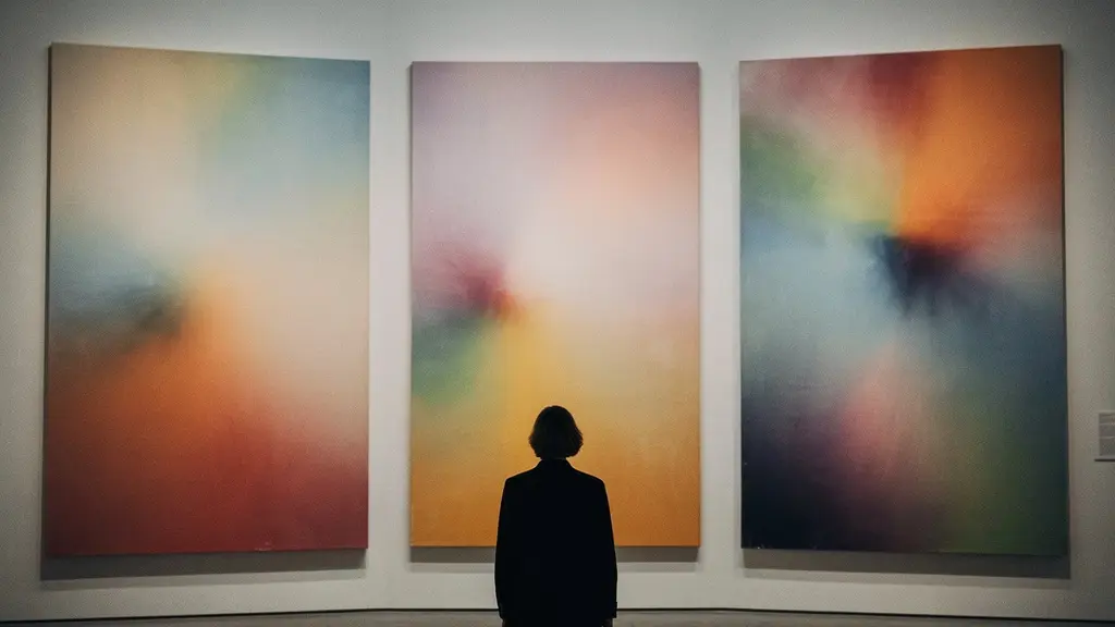
As this image suggests, the ideal experience involves a sense of being absorbed into the work. The human scale becomes secondary to the atmospheric power of the color, creating a reverent, almost spiritual moment of connection that is impossible to achieve through a screen.
My Kid Could Do That: What Separates a Masterpiece From a Mess?
It’s the most common refrain heard in a modern art gallery: “My kid could do that.” While it may seem that way, the difference between a child’s joyful mess and a master’s abstract expression is emotional and compositional intent. An artist like Cy Twombly or Joan Mitchell isn’t just making random scribbles; they are leaving a direct psychological imprint on the canvas. Every line, drip, and scratch is a record of a physical gesture, which is itself a translation of an internal state. And remarkably, the “language” of these marks is more universal than we think.
Our brains are surprisingly adept at connecting types of lines with types of feelings. This isn’t just a subjective opinion; it’s a documented psychological phenomenon.
Sharp, jagged, short lines were generally associated with negative (unpleasant) emotions, and long, curvy lines with positive (pleasant) emotions.
– Claudia Damiano and Pinaki Gayen, Journal of Vision
A child’s drawing might contain these elements by chance, but a master artist controls them. They can create a feeling of anxiety with a dense thicket of sharp, chaotic lines, then offer a moment of release with a single, sweeping curve. This is deliberate emotional choreography. Furthermore, the ability to express emotion through abstract marks appears to be an innate human skill. Fascinating research from the University of Toronto reveals that when asked to draw emotions like anger or joy abstractly, both art students and non-art students produced remarkably similar types of marks. This suggests we all share a basic, intuitive vocabulary of abstract expression.
So, the next time you see a painting that looks “simple,” try to look past the surface. See the energy in a fast, aggressive brushstroke. Feel the calm in a slow, deliberate line. Acknowledge the tension where two jagged forms meet. You aren’t looking at random marks; you’re looking at a fossil record of human feeling, intentionally laid bare.
Framing Abstraction: To Float or Not to Float Your Canvas?
The experience of an abstract work doesn’t end at the edge of the canvas. The frame—or lack thereof—is a critical part of the perceptual environment, acting as the final word in the artist’s statement. It tells your brain how to process the energy contained within the painting. Choosing how to frame an abstract piece is a decision about controlling its emotional bleed. Do you want to contain its energy, or let it spill out and consume the room?
A traditional, ornate frame can feel contradictory to a modern abstract. It can domesticate the work, forcing a raw, expressive piece into a formal, historical context. Sometimes this tension is the goal, but often it constrains the art’s power. On the other hand, leaving a large-scale work with no frame at all is a bold choice. It allows the painting to become a part of the wall, blurring the line between the art and the space it inhabits. The color and texture seem to “bleed” into the room, creating a fully immersive experience that’s difficult to separate from its surroundings.
The most popular contemporary solution is the float frame. This minimalist style creates a small gap between the edge of the canvas and the frame, making the artwork appear to levitate within its boundary. That gap, that “visual pause,” is incredibly powerful. It gives the artwork its own distinct space, emphasizing it as a unique object while still allowing it to breathe. The shadow line it creates adds a subtle layer of depth and sophistication. Each choice sends a different emotional signal.
The following table, based on common principles of art presentation, breaks down how these choices shape the viewer’s experience. An analysis of framing impact highlights these distinct effects.
| Frame Type | Visual Effect | Best For | Emotional Impact |
|---|---|---|---|
| Float Frame | Creates visual ‘pause’ and shadow line | Modern abstracts requiring breathing room | Emphasizes artwork’s objecthood and isolation |
| Traditional Frame | Contains and grounds the energy | Works needing formal presentation | Can constrain or elevate depending on style |
| No Frame | Allows work to ‘bleed’ into space | Large-scale works meant to engulf viewer | Creates seamless integration with environment |
Impasto Techniques: How Thick Paint Creates Shadow and Physicality?
Abstract art engages more than just our eyes; it speaks to our sense of touch. One of the most powerful ways it does this is through impasto—the technique of applying paint so thickly that it stands out in three-dimensional relief. When you see a painting by an artist like Frank Auerbach or Vincent van Gogh, you’re not just seeing color and form; you’re seeing a physical, sculptural surface. The paint itself has weight, physicality, and casts its own shadows.
This texture creates a profound somatic resonance. A heavily textured surface can feel raw, energetic, or even violent. The thick, layered paint is a direct psychological imprint of the artist’s force and movement. Conversely, a smooth, glossy surface can evoke feelings of calm, control, and restraint. The genius of many abstract expressionists lies in their ability to play these textures against each other. In her work, Helen Frankenthaler mastered the tension between raw and refined surfaces, holding the viewer in a state of emotional ambiguity that mirrors real life.

As this close-up view demonstrates, the ridges and valleys of impasto paint create a miniature landscape. The most fascinating aspect of this physicality is how it interacts with light. As you move around the painting, or as the ambient light in the room changes throughout the day, the shadows cast by the paint shift. A peak of white paint might catch the morning light, while a deep blue valley falls into shadow. This makes the painting a living, changing object. Its mood is not static; it responds to its environment, and to your position relative to it. You are in a dynamic relationship with a physical object, not just passively viewing a flat image.
Seeing in Grey: How to Train Your Eye to Ignore Color Distractions?
This may sound counter-intuitive, but one of the best ways to understand an abstract painting’s emotional power is to learn to ignore its most seductive element: color. Color can be so overwhelming that it distracts from the work’s underlying structure—its skeleton. This skeleton is made of values: the relative lightness and darkness of the shapes and marks. The arrangement of values, or the “value structure,” is what gives a composition its foundational strength, rhythm, and drama.
A painting with high-contrast values (stark blacks next to bright whites) will feel dramatic, energetic, and loud, regardless of the specific colors used. A painting with a low-contrast, narrow range of values (all mid-tone grays) will feel calm, atmospheric, and quiet. Training your eye to see these values is a discipline that will unlock a new layer of appreciation. It allows you to see the artist’s compositional choices with greater clarity, separating the structural integrity from the emotional wash of color.
How can you practice this? It involves tricking your brain into momentarily ignoring hue. When you do this, you begin to see the pure architecture of the piece. This skill can transform your gallery visits from a passive walk-through into an active analysis.
Your Action Plan: Exercises for Value-Based Viewing
- Squint at the painting: This is the oldest trick in the artist’s book. Squinting reduces the saturation your eyes perceive, making the value relationships pop.
- Use your phone: Take a photo of the artwork and immediately convert it to grayscale or black and white. This will instantly reveal the compositional skeleton.
- Cover one eye: Looking with one eye reduces depth perception and helps flatten the visual experience, making it easier to see shapes and their relative values.
- Use filters: Viewing the painting through colored sunglasses (or even a piece of colored cellophane) can help neutralize the painting’s own hues, making values easier to distinguish.
- Practice sketching: Do rapid 30-second sketches of compositions using only a black marker or pencil. This forces you to focus only on capturing the main dark and light shapes.
By practicing these techniques, you train yourself to see the two paintings that exist in one: the vibrant, emotional world of color, and the strong, silent world of value that holds it all together.
Too Much Stimulus: When Does Immersion Become Nausea or Anxiety?
The very qualities that make abstract art so powerful—its scale, its immersive color, its raw energy—can also make it overwhelming. Standing in front of a massive, vibrating canvas can sometimes tip from exhilarating to agitating. The somatic resonance can manifest not as a pleasant warmth but as a knot in your stomach. The visual vibration can become a dizzying flicker. This is not a failure on your part as a viewer. It is a testament to the artist’s power. Some works are intentionally confrontational, designed to provoke and disturb.
Mark Rothko, an artist whose work is often seen as meditative, was keenly aware of this violent potential. In a review of his work on paper, the Boston Globe recalls his startling self-assessment: “Behind those colors there hides the final cataclysm. I’m the most violent of all the American painters.” This quote reveals the immense tension and turmoil simmering just beneath his serene fields of color. When you feel overwhelmed, you may be accurately perceiving the “final cataclysm” he embedded in the work.
As an art therapist, I encourage people to honor this response. Your feeling of anxiety or even nausea is a valid interpretation. The artwork has successfully triggered a strong physiological reaction. The key is to develop strategies to manage that intensity without shutting down. Don’t feel pressured to “endure” a piece of art. It’s perfectly acceptable to find a work “too loud” and to step away. You can find an anchor point within the chaos, like tracing a single line with your eye, or mentally isolating one small corner to focus on. This allows you to regain a sense of control over the visual information. Treat the artwork not as an assault, but as a conversation you can pause and return to when you are ready.
Key Takeaways
- Abstract art is an experience, not a puzzle. Its goal is to trigger a direct emotional and physical response in the viewer.
- Artists use tangible tools like color temperature (advancing/receding) and texture (impasto) to create a physical presence and manipulate the viewer’s perception of space.
- The difference between a child’s scribble and a masterpiece is intent. Master artists use a universal language of lines and gestures to choreograph an emotional journey.
How Can Understanding Expressionism Help You Overcome Your Own Blocks?
We’ve spent this time learning to read the emotional language of others, but the final step in this journey is turning that understanding inward. By seeing how artists translate their internal states into a physical, visual language, you gain insight into a powerful tool for your own expression. This is the core of expressionism: the belief that art can be a direct conduit for feeling, bypassing logic and self-criticism. As artist Claire Desjardins notes, the goal is to transform personal experience into a form that connects deeply.
Understanding this process can demystify not only the art on the wall, but also the creative blocks in our own lives. Artists use specific techniques to break through hesitation and access a state of pure expression. They might paint with their non-dominant hand to force new neural pathways, or start by simply writing a word for a feeling on the canvas and responding to it with marks. These aren’t just tricks for making art; they are strategies for getting out of your own head. They are about prioritizing the *act* of expression over the *result*.
This is the ultimate gift of abstract art. It teaches us that our feelings—even the messy, chaotic, and overwhelming ones—have a shape, a color, and a texture. It gives us permission to express ourselves without needing the “right” words or a perfect, recognizable image. It models a way of being in the world that is immediate, authentic, and unapologetically physical. By learning to see the courage and vulnerability in a brushstroke, we can perhaps find a little more courage to face the blank canvases in our own lives, whatever form they may take.
By embracing these concepts, you can transform your relationship with abstract art from one of confusion to one of profound connection, turning every gallery visit into a new opportunity for self-discovery.
Frequently Asked Questions on Engaging with Abstract Art
How can I navigate a visually dense painting without feeling overwhelmed?
Find a ‘resting point’ for your eye, trace a single line through the chaos, or mentally isolate one small quadrant to regain control. These anchoring techniques help manage the visual information.
Is it okay to step away from an artwork that feels too intense?
Absolutely. Frame the experience not as a personal shortcoming but as a potential mismatch. It’s valid to find a work ‘too loud’ and to step away, treating it like a conversation you can return to later when ready.