
A winning landscape portfolio is not a collection of your best photos; it’s a silent pitch demonstrating your editorial intelligence to a magazine editor.
- Geographical and thematic consistency is non-negotiable for the UK market; mixing locations shows a lack of focus.
- A ruthlessly curated edit of 15 exceptional images is vastly more powerful than 50 good ones, as it respects an editor’s time and signals your confidence.
Recommendation: Stop thinking like an artist showing their work and start thinking like an editor building a feature. Curate a tight, narrative-driven sequence that solves a problem for them.
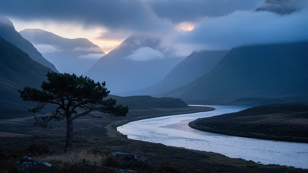
You have the shots. The dramatic light over a Scottish glen, the misty morning in the Lake District, the crashing waves on the Cornish coast. You’ve spent years honing your craft, and now you want your work seen in the pages of a prestigious UK outdoor magazine. But you send your portfolio and hear nothing back. The hard truth is that brilliant individual images are not enough. Editors aren’t just looking for pretty pictures; we’re looking for photographers who can think like us. We’re looking for proof of editorial intelligence.
Most photographers believe the key is to showcase their range, mixing their best shots from various trips and styles. They include detailed technical data in the captions and believe a digital portfolio is modern and efficient. But what if this approach is precisely what’s getting your portfolio dismissed? What if the secret isn’t showing how skilled you are, but how well you understand the narrative and atmospheric needs of a publication? Your portfolio should not be a gallery; it should be a well-rehearsed, silent pitch that proves you can build a compelling visual story.
This guide will deconstruct the process from an editor’s perspective. We will move beyond the generic advice and focus on the strategic decisions that separate an amateur collection from a professional, commission-winning portfolio. We will cover why thematic consistency is paramount, how to choose a presentation format that signals quality, how to write captions that sell the story, and why a ruthless edit is your most powerful tool. Ultimately, this is about learning to transition your vision from standalone images to a cohesive body of work that commands an editor’s attention.
This article provides a complete roadmap for curating your landscape work with the precision of a photo editor. The following sections break down each critical stage, from establishing a coherent theme to preparing your work for the fine art market.
Summary: Crafting an Editor-Ready Landscape Portfolio
- Why Mixing Tropical Beaches With Scottish Glens Confuses Your Client?
- Physical Book or iPad: Which Presentation Format Wins High-End Clients?
- Beyond “Nice View”: How to Write Captions That Sell the Story?
- Editorial vs Commercial: Where Does Your Moody Landscape Work Belong?
- The Quantity Trap: Why Showing 50 Good Images is Worse Than 15 Great Ones?
- What Distinguishes a Fine Art Series From a Random Photo Collection?
- The Flip: Is Buying Young Artists to Sell Quickly a Viable Strategy?
- How to Transition From Commercial Shoots to Selling Fine Art Prints?
Why Mixing Tropical Beaches With Scottish Glens Confuses Your Client?
The first test of your editorial intelligence is focus. When an editor receives a portfolio that jumps from the Yorkshire Dales to the jungles of Costa Rica and back to the Brecon Beacons, the immediate impression is not one of versatility, but of confusion. It signals that the photographer lacks a distinct voice and, more importantly, hasn’t researched the target publication. You are creating a problem for the editor, who now has to mentally sift through your work to find a relevant story, a task they simply do not have time for.
A portfolio with a tight geographical and thematic coherence proves you are a specialist. It demonstrates that you have a deep, intimate knowledge of a particular landscape, its moods, and its light. This is exactly what UK-based publications are looking for. For instance, an analysis of leading publications reveals a distinct preference for regional specificity. As the editorial focus of Outdoor Photography magazine shows, there is a strong emphasis on British landscapes, reflecting a desire to connect with a local audience through familiar yet inspiring scenery. Showing a portfolio dedicated to the Scottish Highlands tells an editor you can be commissioned for a story on the Cairngorms.
Your goal is to present a body of work so cohesive that the editor can immediately envision it as a feature in their magazine. This means grouping images by specific regions, seasons, or even a particular journey. A portfolio that explores the seasonal progression of a single national park is far more powerful than a “greatest hits” collection from around the globe. This demonstrates not just technical skill, but a thoughtful, project-based approach—the hallmark of a professional.
Physical Book or iPad: Which Presentation Format Wins High-End Clients?
In an age of digital immediacy, presenting your portfolio on an iPad seems efficient and modern. However, in the world of high-end editorial and fine art, the medium is part of the message. The decision between a physical book and a digital screen is a crucial signal of your professionalism and your respect for the craft of photography. While a tablet is acceptable for some commercial or documentary reviews, it often falls short when trying to make a lasting impression on a top-tier photo editor.
A beautifully crafted physical portfolio book offers a tactile, contemplative experience that a screen cannot replicate. The weight of the book, the texture of the paper, and the richness of the prints all contribute to the perceived value of your work. It forces a slower, more deliberate viewing process, allowing each image to be absorbed without the distraction of notifications or the temptation of a quick swipe. As esteemed industry voice Rob Haggart of A Photo Editor states, the printed book remains the benchmark for serious reviews. He notes:
The gold standard for portfolio reviews is a book with finely crafted prints, a well rehearsed pitch, promo card leave behinds and some personal project options in a separate book, ipad or Blurb type book. You can be sure when you sit down in that chair the photographers before and after you are doing this.
– Rob Haggart, A Photo Editor
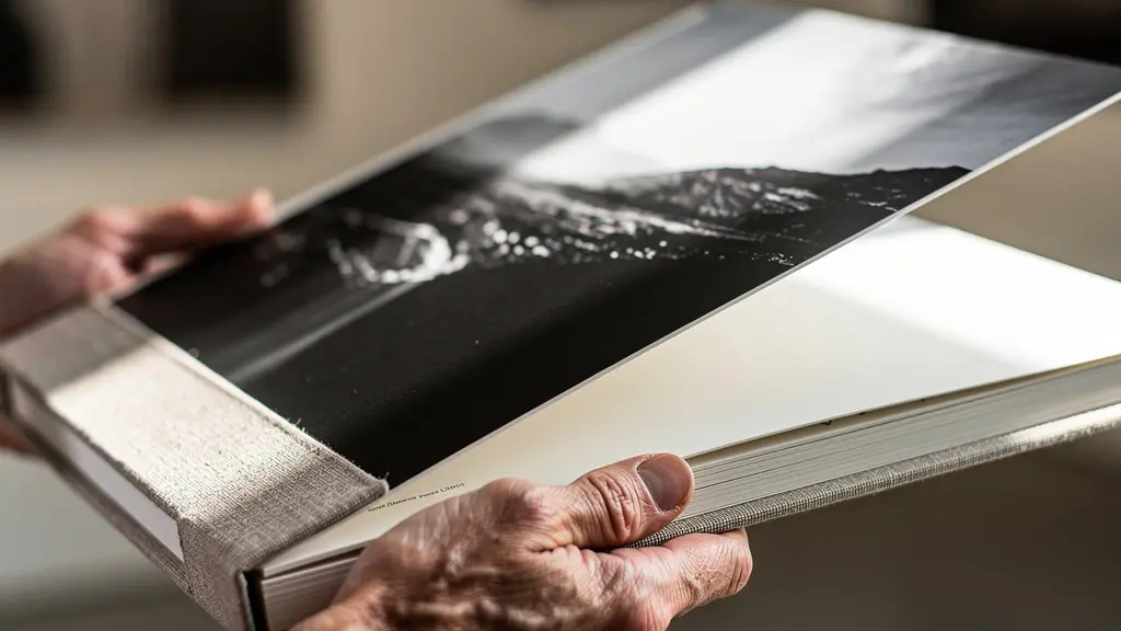
This doesn’t mean digital has no place. An iPad can be a superb tool for showing secondary projects or a wider archive *after* the main presentation. But leading with a physical book demonstrates investment, confidence, and a deep appreciation for the photograph as a physical object—a quality highly valued by those who produce printed magazines.
The following table, based on an analysis of portfolio presentation formats, breaks down the key differences for an editorial context.
| Aspect | Physical Book | iPad |
|---|---|---|
| First Impression | Premium, tactile experience | Modern, versatile |
| Review Speed | Slower, more contemplative | Faster, swipe-able |
| Editorial Reception | Expected for fine art | Accepted for editorial/documentary |
| Memory Impact | Higher retention through haptic experience | Lower due to screen fatigue |
| Cost | $100-1000+ per book | $13-50 for portfolio apps |
Beyond “Nice View”: How to Write Captions That Sell the Story?
A common mistake photographers make is treating captions as an afterthought—a place for a location tag and technical data. This is a missed opportunity. For a photo editor, a caption is not a label; it’s a piece of micro-storytelling that should deepen the viewer’s connection to the image. A caption that says “Loch Ness, f/11, 1/50s” provides information, but a caption that evokes history, myth, or a personal reflection provides a narrative. It’s the difference between a picture of a place and a story about a place.
Your goal is to write captions that add a layer of emotional or cultural significance. This aligns with the editorial approach of top UK magazines, which consistently emphasize storytelling that connects readers to the landscape on a deeper level. Instead of stating the obvious, hint at the unseen. Was there a historical event here? Is it a site of local folklore? Does it hold personal meaning for you? This context elevates a beautiful image into a compelling piece of content an editor can build a feature around.
A powerful technique is the three-act structure. It transforms a simple description into an engaging narrative hook:
- The Emotional Hook: Start with a feeling, a sensory detail, or a surprising observation. Instead of “A sunrise over Stonehenge,” try “Dawn mist clung to the ancient stones, each one a silent witness to millennia of turning skies.”
- The Evocative Context: Add a layer of historical, cultural, or natural context. Don’t dump facts; weave them in. “…where centuries of pilgrims once gathered to mark the sun’s journey.”
- The Reflective Question: End with a thought that prompts the viewer to look again and ponder. “What stories do these silent witnesses hold for us today?”
Sometimes, the most powerful statement is silence. For a particularly strong or abstract image within a fine art series, the absence of a caption can create its own impact, inviting pure visual interpretation. The key is intentionality: every choice, including the choice to omit a caption, should serve the overall narrative arc of your portfolio.
Editorial vs Commercial: Where Does Your Moody Landscape Work Belong?
Understanding the distinction between editorial and commercial markets is fundamental to positioning your work correctly. Not all landscape photography is interchangeable. The moody, atmospheric, and often melancholic shots of a windswept Scottish glen that would be perfect for an editorial feature in a photography magazine might be entirely wrong for a commercial client like a national tourism board, which typically seeks bright, aspirational, and inviting imagery.
Editorial work is story-driven. Its purpose is to evoke an emotion, tell a story, or document a particular mood and sense of place. Editors in this space value authenticity, atmosphere, and a unique point of view. This is where your dramatic, weather-beaten landscapes thrive. They aren’t trying to sell a holiday package; they are selling a feeling, an experience, and an artistic vision. Your portfolio for an editorial client should lean into this, showcasing your ability to capture the soul of a landscape, imperfections and all.
Commercial work, on the other hand, is client-driven. Its primary purpose is to sell a product or service. This could be a hotel, a holiday destination, or outdoor gear. The imagery required is typically cleaner, brighter, and more optimistic. A commercial client selling trips to the Highlands wants to see blue skies and sun-dappled hills, not brooding storms, because their goal is to make the location look as appealing as possible to a broad audience. While technically excellent, your portfolio of dark, moody landscapes may signal to a commercial art director that you are not the right fit for their brand’s sunny disposition.
Knowing this distinction allows you to create different edits for different targets. Your main portfolio might be your moody, personal work aimed at magazines like On Landscape or Outdoor Photography. But you should also have a separate, brighter portfolio ready for potential commercial clients. This doesn’t mean compromising your style, but rather demonstrating that you have the commercial awareness to adapt to a client’s specific needs—another facet of editorial intelligence.
The Quantity Trap: Why Showing 50 Good Images is Worse Than 15 Great Ones?
One of the most common and damaging mistakes an aspiring photographer can make is overwhelming an editor with too many images. The thinking is understandable: “If I show more, they’ll see my range and are more likely to find something they like.” From an editor’s chair, the opposite is true. A bloated portfolio of 50, 30, or even 20 images is an immediate red flag. It signals a lack of confidence and, crucially, an inability to self-edit—one of the most important skills a professional photographer must possess.
An editor’s time is their most valuable asset. We are looking for photographers who respect that. Presenting a tight, ruthlessly curated sequence of 10 to 15 exceptional images shows that you have done the hard work for us. It proves you know what your best work is and that you have a clear, focused vision. Every image in a short sequence has to earn its place, and the result is that each one is perceived as more significant. In a larger collection, even great images get lost in the noise, and the overall impression is diluted by the merely “good” ones. This phenomenon is known as editor fatigue; by image 25, even the most stunning shot will have lost its impact.
A lean portfolio is an act of confidence. It says, “This is my voice. This is my vision. This is the story I can deliver for you.” It leaves the editor wanting more, not wishing it were over. The editing process is where you demonstrate your true editorial intelligence. It’s not just about removing the bad shots; it’s about removing the good shots to let the great ones shine.
Your Action Plan: The 15-Image Portfolio Edit
- Initial Selection: Start with your 100 best images from the past two years. Be generous at this stage.
- The Justification Test: Go through them. Remove any image you feel you have to explain or justify. Great images should speak for themselves.
- Eliminate Redundancies: Group images by visual weight, mood, and subject. If you have three amazing shots of the same mountain, pick the one definitive image and discard the others.
- The ‘One-Breath’ Test: Can you view the sequence in a single, flowing emotional arc without feeling disjointed? If not, refine the order and remove jarring transitions.
- The Layperson Test: Show your sequence to non-photographer friends. If they look at their watch or lose interest after image 10, you need to cut more. Their attention span is a good proxy for a busy editor’s.
What Distinguishes a Fine Art Series From a Random Photo Collection?
Many photographers assemble a portfolio of their most aesthetically pleasing images, believing this constitutes a body of work. This is a collection. A fine art series, however, is something more. It’s a group of photographs that are not just thematically linked (e.g., “Scottish Castles”) but are conceptually unified by a central question, idea, or a consistent visual grammar. A collection is decorative; a series is investigative. It’s the difference between showing what something looks like and exploring what it means.
The transition from a collection to a series begins with a conceptual question. Instead of simply shooting “ruins,” you might ask, “How do these decaying structures reflect a nation’s shifting identity?” This intellectual framework is what elevates the work. It provides a reason for the images to exist together beyond their surface-level subject matter. The photos become evidence in a visual argument, guided by your artist statement, which acts as a manifesto for the project.
This conceptual core must be supported by a strict and consistent visual language. This “visual grammar” is a set of self-imposed rules that unify the series. These constraints might include:
- Recurring Motifs: A repeated shape, object, or type of light that appears throughout the series.
- Compositional Rules: Always placing the horizon on the bottom third, or always using a centered composition.
- A Limited Color Palette: Processing all images with a consistent, restricted range of colors to create a specific mood.
- Technical Consistency: Shooting at the same time of day, in the same weather conditions, or with the same lens and aperture.
This repetition and variation within established constraints create a visual rhythm that holds the series together as a singular, cohesive statement. It shows an editor that you can execute a long-form project with discipline and a clear artistic vision—a key requirement for moving into the world of fine art and gallery representation.
Key Takeaways
- Your portfolio is a test of your editorial intelligence; it must be curated to solve a problem for the editor, not just showcase your favorite shots.
- Ruthless curation is your most powerful tool. A tight sequence of 15 stellar images is always better than 50 good ones, as it demonstrates confidence and respects the editor’s time.
- Success in the UK market depends on thematic and geographical focus. A deep dive into a specific British landscape is far more compelling than a global ‘greatest hits’ collection.
The Flip: Is Buying Young Artists to Sell Quickly a Viable Strategy?
In the art market, “flipping” refers to a short-term, speculative strategy of buying work from an emerging artist only to sell it quickly for a profit. While our context is photography portfolio submissions, not art investment, a parallel and equally flawed mindset exists. The photographer’s version of “flipping” is a transactional, short-term approach: firing off a generic portfolio to dozens of editors, hoping for a quick sale or a one-off feature, without any attempt to build a genuine connection.
This strategy is rarely viable. Editors can spot a generic, mass-emailed submission from a mile away. It shows a lack of specific interest in our publication and suggests the photographer is more interested in a quick win than a collaborative relationship. Just as speculative art flipping can burn bridges with galleries, this approach to submissions burns bridges with editors. We are looking for photographers to partner with for the long term, people we can rely on for future commissions because they understand our brand and our audience.
The far more successful strategy is one of long-term relationship building. This involves deeply researching a small number of target magazines, understanding their specific aesthetic and needs, and then crafting a bespoke pitch. It means engaging with editors respectfully over time, perhaps by sharing a project you believe is a perfect fit for a specific section of their magazine. This approach is exemplified by photographers like Thomas Heaton, who built an entire career not by “flipping” his work, but by authentically sharing his process and building a loyal community. In his own words about his journey, he highlights the power of social media to connect with an audience on a deeper level, which in turn attracts editorial interest. This demonstrates that authentic engagement yields far better results than transactional tactics.
Instead of aiming for a quick flip, aim to become a trusted resource. Build a reputation for quality, reliability, and a deep understanding of an editor’s needs. This investment in relationships will pay far greater dividends over your career than any single, quick sale ever could.
How to Transition From Commercial Shoots to Selling Fine Art Prints?
The transition from a successful commercial or editorial photographer to one who sells fine art prints is a common ambition, but it requires a significant shift in mindset. While your technical skills are transferable, the purpose and presentation of your work must evolve. A commercial shoot is about fulfilling a client’s brief. An editorial shoot is about illustrating a story. A fine art print, however, must stand entirely on its own as a desirable object, imbued with your unique artistic signature.
This journey is the culmination of all the principles we’ve discussed. It begins with developing a cohesive fine art series, as opposed to a collection of beautiful but unrelated images. This is where you move beyond documenting landscapes and start interpreting them through a distinct conceptual framework and visual grammar. Your work must have a clear authorial voice that is recognizably yours. This is what a gallery owner or a print collector is investing in—not just a picture of a mountain, but your specific vision of that mountain.
The case of Nicholas Parker is an inspiring example of this evolution. As a photographer who started with the goal of being published in major magazines like National Geographic, he first mastered the craft of creating powerful, story-driven images for an editorial context. After achieving that goal, he spent a decade mastering a personal technique to produce images with bold color and distinct contrast, transitioning his focus. His portfolio, as seen on platforms like Zenfolio, showcases this evolution from world-class documentarian to a fine art photographer with a defined, marketable style. This demonstrates that the path to selling prints is paved with the discipline learned in the editorial world.
Ultimately, transitioning to the fine art market means productizing your vision. It requires the same ruthless curation as your editorial portfolio, a premium presentation (often through a physical book and gallery-quality prints), and a clear narrative about what your work stands for. It’s about building a brand around your art, where each print is a testament to the unique voice you’ve cultivated over your career.
By applying these principles of editorial intelligence, you move from being just another photographer with a camera to a strategic partner an editor wants to work with. Start today by looking at your own work not as a collection of memories, but as the raw material for a compelling, focused, and unforgettable narrative.