The debate isn’t about sharpness; it’s about discipline. A monochrome-only sensor forces a total commitment to tonality that is impossible to replicate with post-processing.
- Without a color filter array, a monochrome sensor captures pure luminance, resulting in superior micro-tonality and detail integrity.
- Decisions on filtration and exposure are final, demanding a rigorous, pre-visualized approach to sculpting light and shadow before the shutter is pressed.
Recommendation: Embrace a monochrome sensor not for convenience, but as a deliberate artistic constraint to elevate your command of the black and white medium.
For a decade, my world has been rendered in shades of grey. I haven’t shot a color frame in ten years, not out of limitation, but out of a deep, almost obsessive commitment to tonality. The modern photographer is often told that a dedicated monochrome sensor is an expensive indulgence. “Just convert a color file,” they say. “The software is so good now.” This argument, while practical, completely misses the point. It frames the choice as a technical preference, a simple matter of image quality, when in reality, it is a profound philosophical divide.
Choosing a monochrome-only sensor is not about achieving marginally sharper files; it is about willingly shackling yourself to a discipline. It’s an intentional removal of the safety net that is color information. This is not a shortcut to “better” black and white images. It is a declaration that you are no longer a photographer who happens to shoot in monochrome, but a practitioner whose entire process—from the way you see the world to the way you craft a final print—is dictated by the interplay of light, shadow, and texture alone. This is the path of the purist, where every decision is irreversible and every success is earned before the image ever reaches a screen.
This guide isn’t here to debate megapixels or to sell you a camera. It’s here to walk you through the discipline of the monochrome-only workflow. We will explore how to retrain your eye, understand the true nature of the detail you gain, and accept the unforgiving constraints that ultimately lead to a more profound mastery of the black and white medium. This is the journey of tonal commitment.
To fully grasp this demanding yet rewarding path, this article is structured to guide you from the foundational act of seeing to the finality of the print. The following sections will deconstruct each stage of the pure monochrome process.
Summary: A Deep Dive into the Monochrome-Only Discipline
- Seeing in Grey: How to Train Your Eye to Ignore Color Distractions?
- Sharpness and Noise: How Much Detail Do You Really Gain Without Color Arrays?
- Red, Orange, or Yellow: Which Filter Creates the Most Dramatic Sky?
- The Skin Tone Problem: Why You Can’t Fix Blemishes Easily on a Monochrome Sensor?
- Matte vs Gloss: Which Paper Surface Enhances Deep Blacks Best?
- Paper Types and Finishes: Which One Suits High-Contrast Black and White?
- Why British Cities Look Better in High Contrast Black and White?
- How to Transition From Commercial Shoots to Selling Fine Art Prints?
Seeing in Grey: How to Train Your Eye to Ignore Color Distractions?
The first and most difficult step in the monochrome journey has nothing to do with technology. It is a rewiring of your own perception. Color is a liar; it screams for attention, distracting from the fundamental structure of a scene—its tones, textures, and forms. A vibrant red barn might seem like a strong subject, but in monochrome, it could melt into the grey of the surrounding foliage if their luminance values are too similar. The purist must learn to see the world not in hues, but in a spectrum of luminosity. This is not an innate talent; it is a practiced skill, a form of visual meditation.
Initially, this process is frustratingly difficult. As one photographer noted when starting this journey, “I wasn’t particularly good at composing based on tones rather than colors, but I tried.” This honesty is key. You must actively force yourself to squint, to blur out the distraction of color and see only the relationships between light and dark. You begin to analyze scenes for their tonal separation. Where does the highlight on a cheekbone end and the mid-tone begin? How does the texture of rough stone create a pattern of micro-shadows? Setting your camera’s electronic viewfinder to its monochrome mode is an essential training tool, providing immediate feedback and forcing this new way of seeing. The goal is to reach a point where the monochrome preview merely confirms what you have already pre-visualized in your mind’s eye.
This training extends beyond the camera. It involves studying the work of masters—not just their compositions, but the tonal architecture within them. It means observing the world during the golden hour, not for the warm colors, but for the long, raking shadows that sculpt form through light. Over time, you stop noticing the color of a subject and start seeing its potential as a shape defined by light. The world becomes a vast canvas of potential gradations, and color becomes little more than a noisy distraction.
Sharpness and Noise: How Much Detail Do You Really Gain Without Color Arrays?
The most commonly cited benefit of a monochrome sensor is increased sharpness and detail. While true, the reason is far more significant than a simple boost in resolution. A standard color sensor uses a Bayer or similar color filter array (CFA), where each photosite is covered by a red, green, or blue filter. This means that to create a full-color image, the camera’s processor must guess the two missing color values for every single pixel. This process, known as demosaicing or debayering, is an act of interpolation. It’s an incredibly sophisticated guess, but a guess nonetheless. It inherently softens the image and can introduce artifacts.
A monochrome sensor has no such filter array. Every single photosite captures pure luminance data. There is no guessing, no interpolation. The result is a raw file with absolute pixel-level integrity. This isn’t just about making the image “sharper” in the way a software slider does. It’s about capturing a more honest, intricate rendering of texture and micro-tonality. Studies have shown that because of the lack of a CFA and the demosaicing process, monochrome sensors achieve approximately 33% better spatial resolution than their color counterparts with the same pixel count. A 24-megapixel monochrome sensor, therefore, resolves detail closer to what you’d expect from a 36-megapixel color sensor.
This technical gain is most apparent in fine textures: the weave of a fabric, the grain of weathered wood, or the subtle pores of human skin. Where a color-converted file might smudge these details into a vague texture, a true monochrome file renders them with startling clarity. The noise structure is also different. Because there is no color noise to suppress, the grain that appears at high ISOs is more akin to the pleasing, film-like grain of classic emulsions rather than the ugly, blotchy chroma noise that plagues high-ISO color files. This purity of data is the technical foundation of the monochrome commitment.
Red, Orange, or Yellow: Which Filter Creates the Most Dramatic Sky?
Committing to a monochrome sensor means rediscovering a tool that many digital photographers have forgotten: the physical, screw-on filter. With a color file, you can mimic the effect of a red filter in post-production, darkening skies and boosting cloud contrast with a simple click. This is a convenience, but it is also a crutch that severs the link between the moment of capture and the final tonal balance. A monochrome photographer does not have this luxury. As one forum contributor aptly put it, “You can’t choose color filtration after the fact of exposure with a monochrome camera.” This is a fundamental and irreversible constraint.
Your choice of filter—red, orange, yellow, or even green—is a permanent creative decision made in the field. It is an act of tonal sculpting. A yellow filter provides a subtle darkening of blue skies for a natural look. An orange filter creates a more pronounced, dramatic separation between the clouds and a darkened sky. A red filter, the most aggressive choice, can turn a blue sky almost black, creating an apocalyptic, high-impact landscape where white clouds seem to explode from the frame. This decision must be made by reading the light and pre-visualizing the final print. There is no “undo” button. This forces a more deliberate, thoughtful process. You are not merely capturing a scene; you are interpreting it tonally at the moment of creation.
The table below outlines the classic effects of these filters, a foundational piece of knowledge for any serious monochrome photographer.
| Filter Color | Sky Effect | Cloud Contrast | Best Use Case |
|---|---|---|---|
| Red | Very dark, almost black | Maximum | Dramatic landscapes |
| Orange | Moderately dark | Strong | Balanced drama |
| Yellow | Slightly darkened | Subtle | Natural look |
| Green | Neutral to light | Minimal | Foliage emphasis |
This commitment to in-camera filtration is not a nostalgic affectation. It is a core tenet of the monochrome discipline. It demands that you understand the relationship between color and tone, and that you make your artistic choices deliberately, in the real world, under the available light.
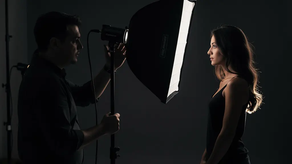
The Skin Tone Problem: Why You Can’t Fix Blemishes Easily on a Monochrome Sensor?
If there is one area where the unforgiving nature of a monochrome sensor truly reveals itself, it is in portraiture. With a color file, a photographer can easily target reddish skin blemishes or blotches using color-based selection tools in post-production. A slight adjustment to the red or magenta channel can make these imperfections vanish. This is a powerful tool, but it is a corrective one. On a monochrome sensor, this option does not exist. A red blemish is simply recorded as a specific shade of grey. If that shade is significantly different from the surrounding skin tone, it will be just as prominent in the final image, and far more difficult to isolate and correct without smudging the underlying skin texture.
This “problem” is, in fact, the greatest teacher. It forces the photographer to abandon post-production fixes and master the most fundamental tool of all: light. Instead of relying on software to correct imperfections, the monochrome portraitist must learn to sculpt the face with light to conceal them. Using soft, directional window light can wrap a subject in a gentle gradation that minimizes texture. Employing negative fill (placing a black card or flag on the shadow side of the face) can increase contrast and subtly hide imperfections in deep, rich shadows. The control must happen before the shutter is pressed. It is the difference between being a “retoucher” and a “photographer.”
This demands a rigorous and methodical approach to every portrait session. You are no longer just capturing a likeness; you are engaged in a delicate act of tonal balancing in real-time. Every decision about the light’s direction, quality, and intensity has permanent consequences. It is a more demanding workflow, but the results are profoundly more authentic and painterly, built on a foundation of light and shadow, not digital manipulation.
Your Pre-Capture Tonal Audit for Portraits
- Light Source Quality: Assess the primary light. Is it hard (creating sharp, revealing shadows) or soft (creating gentle, forgiving gradations)? Choose the quality that best serves the subject’s skin.
- Direction and Ratio: Analyze the angle of the light. Where do the shadows fall? Adjust the light-to-shadow ratio using reflectors (fill) or flags (negative fill) to sculpt features and control tonal contrast.
- Background Separation: Evaluate the tonal relationship between the subject and the background. Is there enough separation to create depth, or do they blend together? Adjust subject-to-background distance.
- Skin Luminance Check: Use the camera’s spot meter to check the luminance values of different skin areas (forehead, cheeks, chin). Are there unwanted “hot spots” or overly dark patches? Adjust lighting accordingly.
- Final Tonal Rehearsal: Before shooting, take a test shot and review it critically on the LCD. Do the tonal transitions feel intentional and flattering? This is your last chance to make adjustments.
Matte vs Gloss: Which Paper Surface Enhances Deep Blacks Best?
The monochrome commitment does not end at the digital file. The ultimate proof of the entire process is the physical print. A file on a backlit screen is a fleeting, temporary thing; a fine art print is the final, tangible expression of your vision. And here, the superior data captured by a monochrome sensor presents its final challenge and reward. With a sensor like the Leica M11 Monochrom capable of capturing an incredible 15 stops of dynamic range, you have a wealth of tonal information, especially in the deep shadows. The choice of paper is not an afterthought; it determines how much of that information will be successfully translated into the final object.
The debate between glossy and matte surfaces is one of tonal priorities. Glossy papers, particularly fiber-based baryta papers, are renowned for their ability to produce a high Dmax—the deepest possible black. This creates prints with stunning “punch” and brilliance, where highlights sparkle and blacks are rich and profound. They excel at separating tones in the highlight and upper mid-tone range, making them ideal for high-impact, contrasty images.
However, matte papers, especially those made from 100% cotton rag, offer a different kind of beauty. While their Dmax is typically lower (blacks are less deep and reflective), their non-reflective surface provides superior tonal separation in the near-black shadows. The subtle, intricate details that a monochrome sensor captures in the darkest parts of the image are often revealed more clearly on a matte surface, without the distraction of glare. They offer a quieter, more contemplative viewing experience. The choice is a creative one: do you want the explosive drama of a glossy baryta or the subtle, textural richness of a matte cotton rag?
| Surface Type | Dmax Value | Tonal Separation | Archival Quality |
|---|---|---|---|
| Baryta Gloss | 2.5-2.7 | Excellent in highlights | 100+ years |
| Matte Cotton | 1.8-2.1 | Superior in shadows | 200+ years |
| Semi-Gloss RC | 2.2-2.4 | Balanced | 50-75 years |
Paper Types and Finishes: Which One Suits High-Contrast Black and White?
Digging deeper into the print, the conversation moves beyond just matte versus gloss. The very substance of the paper and its chemical properties are part of the artistic palette. For the purist, whose image file contains a wealth of subtle gradation, the paper’s ability to preserve that information is paramount. As photographer Jon Stapley notes, “Dynamic range is of huge importance…and is crucial for creating monochrome images with depth and tonality.” A sensor with great dynamic range is only half the equation; a paper that can render it is the other half.
Dynamic range is of huge importance – this defines the difference between the darkest and lightest tones in an image, and is crucial for creating monochrome images with depth and tonality. Cameras with larger sensors offer greater dynamic range.
– Jon Stapley, Amateur Photographer
For high-contrast work, the temptation is to chase the highest Dmax. However, a more sophisticated approach prioritizes tonal range preservation. A paper that can hold detail in the deepest shadows (often referred to as Zone II in the Zone System) while also rendering delicate highlights (Zone VIII) without clipping is the holy grail. This is where high-quality cotton rag and alpha-cellulose papers excel over standard Resin-Coated (RC) papers. They provide a more subtle, expansive tonal scale that allows the richness of the monochrome file to breathe.
Another critical consideration is the presence of Optical Brightening Agents (OBAs). These agents are added to many papers to create the illusion of a brighter, whiter base, which can make prints look vibrant initially. However, OBAs are unstable and will yellow over time, destroying the archival quality and tonal balance of the print. For any work intended as fine art, choosing an OBA-free paper is non-negotiable. The initial “whiteness” is sacrificed for long-term stability and integrity. The slightly warmer, more natural base tone of an OBA-free paper is the mark of a true archival print, the final proof of a process committed to permanence.
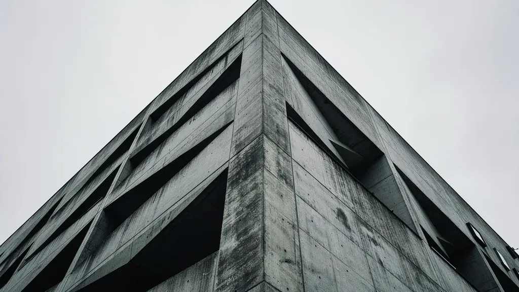
Why British Cities Look Better in High Contrast Black and White?
Applying these principles to a specific genre, such as urban photography, reveals their practical power. British cities, with their often-overcast skies and rich architectural history, are a perfect canvas for high-contrast monochrome. The diffused light of an overcast day, often considered “bad” light by color photographers, becomes an asset. It acts as a giant softbox, eliminating harsh shadows and color temperature shifts, allowing the photographer to focus purely on form, texture, and line. The inherent drama of brutalist concrete or the weathered texture of ancient stone is amplified when stripped of distracting color.
In this environment, the monochrome purist is at a distinct advantage. Instead of fighting with mixed lighting from streetlamps, shop windows, and the sky, they see only a cohesive palette of tones. Architectural leading lines become more powerful compositional elements, guiding the eye through the frame without the competition of color. The goal is to use the city’s geometry and texture as the primary subject. Framing a modern glass skyscraper against a dramatic, red-filtered sky, or isolating the rough, detailed texture of a brutalist concrete wall, creates an image that is about the essence of the urban form, not a literal depiction of it.
This approach requires a different set of techniques. It’s less about waiting for the perfect golden hour and more about embracing the flat, even light of a cloudy day. It’s about seeing the potential for abstraction in the repeating patterns of a facade or the strong diagonal of a modern bridge. The city is no longer a collection of colorful scenes but a quarry of raw geometric and textural material waiting to be sculpted by the monochrome eye. The resulting images are often more powerful, timeless, and emotionally resonant precisely because they are untethered from the literal reality of color.
Key takeaways
- The choice of a monochrome sensor is a commitment to a discipline, not a simple upgrade for sharpness.
- Mastery in monochrome comes from pre-capture control of light and filtration, as post-production fixes are severely limited.
- The final print is the ultimate goal, and the choice of paper is a critical artistic decision that defines the final look and feel of the image.
How to Transition From Commercial Shoots to Selling Fine Art Prints?
The journey detailed in the preceding sections—the retraining of the eye, the mastery of irreversible constraints, the obsession with the final print—is the very bridge between commercial photography and fine art. Commercial work often prioritizes flexibility, speed, and client-pleasing color. It is a world of safety nets and post-production fixes. Fine art, particularly in the monochrome tradition, is about vision, intent, and uncompromising execution. Committing to a monochrome-only workflow is a powerful statement of that intent. It signals a shift from a service provider to an artist with a distinct point of view.
This commitment comes at a literal cost. As an example, a dedicated monochrome version of a popular camera can command a significant price increase; Petapixel notes that for one model, the GR IV Monochrome commands a $700 premium over its color counterpart. This investment is a filter in itself, weeding out the casual user from the dedicated practitioner. When you choose to walk this path, you are telling the art world that you take tonality so seriously that you have invested in specialized equipment to pursue it. Your portfolio, built on the principles of tonal sculpting and print mastery, will have a cohesion and integrity that is difficult to achieve when flipping between color and monochrome conversions.
The transition is therefore not just about changing your subject matter, but about changing your entire process. It’s about building a body of work that is undeniably yours, where every print is a testament to a series of deliberate, in-camera decisions. It’s about being able to speak with authority about your choice of filter, your lighting, and your paper, because you were forced to master them. This is what collectors and gallerists look for: not just beautiful pictures, but a deep, consistent, and well-articulated artistic practice. The monochrome-only path is an arduous one, but it is one of the most direct routes to transforming your craft into art.
To begin this transition, the first step is to invest not just in gear, but in the discipline itself. Start by embracing the constraints, learning to see tonally, and making the final print the ultimate arbiter of your success.
Frequently Asked Questions about Why Use a Monochrome-Only Sensor Instead of Converting Color Files?
Should I prioritize Dmax or tonal range for high-contrast work?
For high-contrast monochrome prints, tonal range preservation is more critical than maximum black density. A paper that maintains separation in near-black shadows will reveal the subtle details that monochrome sensors excel at capturing.
How do Optical Brightening Agents affect long-term print stability?
OBAs create brighter whites initially but yellow over time. For archival permanence, choose OBA-free papers, though they may appear slightly warmer when first printed.
Is metallic paper suitable for traditional black and white photography?
Metallic papers can enhance certain modern architectural or abstract monochrome work but may feel inappropriate for classical portraiture or documentary photography due to their contemporary appearance.